Creating a movie visualization
Published on March 18th, 2019

I created a visualization of all the movies and series I have seen since 2015. You can see it in a browser here.
Mini usage guide:
It has two views. One shows the movies stacked by release date, the other one shows them stacked by the week that I watched them. Toggle these views from the menu left above or by pressing "R" or "W".
See movie details and maybe my mini-review by clicking/tapping a movie.
Highlight my favorites by click the menu option or pressing "F".
What follows is a little history of the project.
Watch list frenzy 🤓
In early 2015 I started keeping a "watch list" with movies and series that were recommended to me in conversations. Some of those I really liked, so soon after I added a "watched" section. With this I could easily do my part in helping others find good content.
And so it happened that, for 4 years, I faithfully kept noting down the movies I watched. The list looked like this:

In early 2018, while taking a data visualization course, I got the idea to visualize these movies on a timeline. I started by writing a script that parsed my textual movie annotations and converted these to a structured format, readable by a program.
With my fledgling knowledge of the visualization framework D3.js I got as far as to visualize a dot for every day that I watched a film on a horizontal time scale. Terrific!

But then life threw other things on my plate. I left it there and forgot about the idea.
Movie Visualization: Reborn ⚡️
Exactly a year later, I found myself browsing through old project folders. I bumped on the visualized movie dots and got excited again. My studies in Finland are a bit more flexible, so there was time to spare for this project.
I built on the previous work and leveraged my newfound friendly spreadsheet tool Airtable to collect my movie notes and watch dates in a machine-readable format. Airtable has an intuitive API that can be used to pull the most recent version of the data easily, without worrying about editing, parsing or exporting text files.
Next, I wrote a script that merged these "datafied" notes with information from the Open Movie Database, a cool API that gives access to all IMDb information. The visualization was starting to come together now. I kept thinking of things to add.
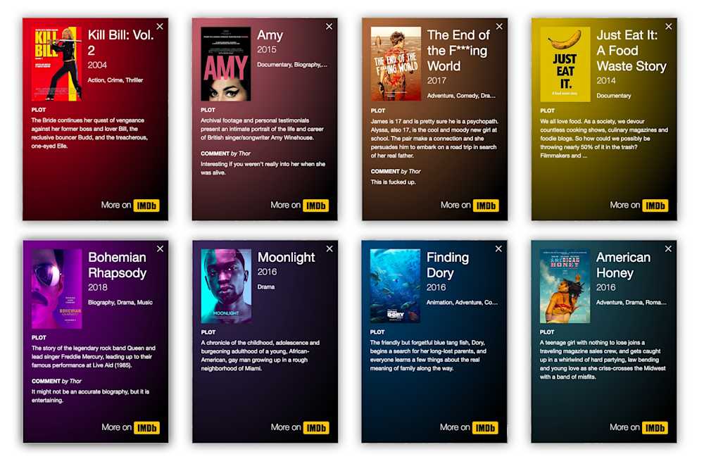
The coolest by far was an ambient background color effect on movie details. I used a library for that and wrapped it with a statistical function that selects the most poppy color from each movie poster. This makes for a real poster palette:

Finally, I presented the visualization to a few movie-junkie friends around here to gauge their reactions. That resulted in the addition of a view to see movies by release date, which I prefer now. I also made it usable on smartphone screens.
So what? 🤷♂️
What's the use of it? Not much. Sometimes things don't need to be useful, they can just be fun to make.
However, I like browsing the visualization and hovering over the titles (NB: in Firefox, there's more hover effects supported). It's interesting to see that there are some release years from which I didn't see that many movies, creating holes in the visualization. I've lately been catching up with those years by watching their Academy Awards' Best Picture nominations.
And who knows, maybe someone will get inspiration for a next thing to watch while browsing the grid.
How can I get this?
The code is available to use here on Github. All you need is basically a list or spreadsheet with movie titles. A properly formatted Airtable document should get you to your own version with minimal effort. Do ask if you need help setting it up, some programming skills are useful.
PS: I'm still open for movie recommendations. You can fill in this form for that. Find out here with Ctrl+F if I've seen it already ;) Thank you, thanks Airtable.