Mail view styling in Thunderbird
Published on January 8th, 2017
I find it tiring to read large chunks of text that take up the full width of a browser or mail window. Paragraphs with a book-like line width of around 700px and unobtrusive margins are far more readable.
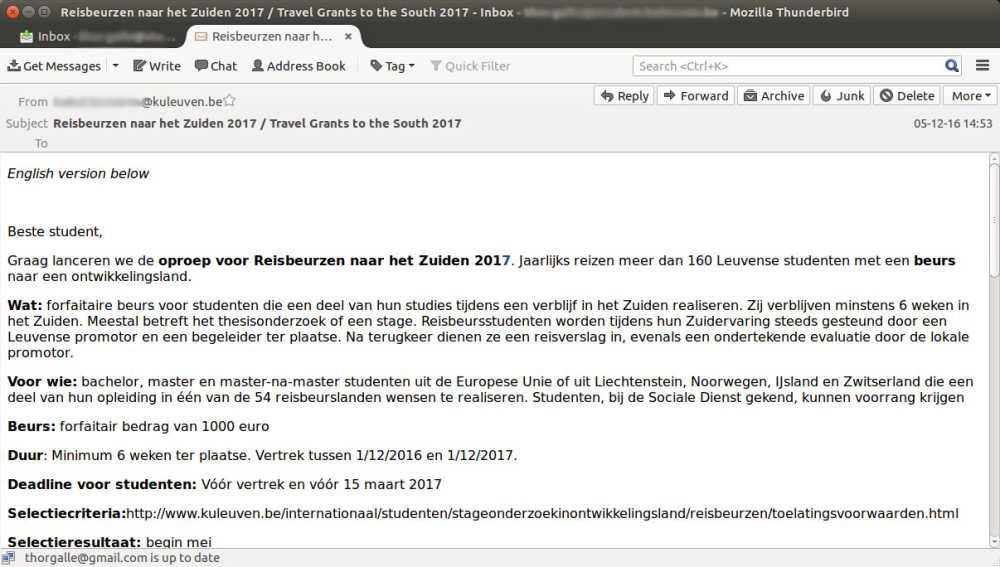
So, I had a problem with the display of email in Mozilla Thunderbird:

Some research led me to userContent.css: a style sheet used by Thunderbird to style the content of all mails, both written an viewed. It only affects the local machine, so it is not included in sent messages. Perfect!
This is the quick CSS I threw in to reach my goal:
~/.thunderbird/[profile folder name]/chrome/userContent.css:
/* make mails more readable */
html {
max-width: 700px;
margin: 0 auto;
padding: 2em 2em;
line-height: 1.8em;
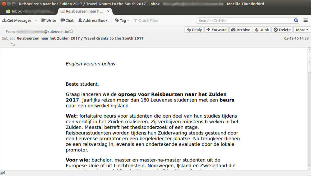
}And this is the result:

A dissection of the CSS:
I didn’t know the CSS selectors I could use to target Thunderbird's plain mail text, so I just gave
htmla shot. Seems to work!max-widthinstead ofwidthensures a readable line width and avoids a horizontal scrollbar when the window is smaller than 700px.margin: 0 auto;centers the text box horizontally.The
paddingensures some “margins”, even on a window smaller than 700px (a short hack).
I mainly wanted it to work for plain text mails, but since most rich HTML mails today are designed to work on all kinds of viewports, they scale nicely too. I do think their CSS overrides userContent.css though.
Do you know a cleaner way of doing this in CSS? I'd love to hear!