✅ Voc Enhancer's first feature request
Published on June 9th, 2019
A while ago, a new review came in for Vocabulary.com Enhancer, an extension I made that adds functionality like translations to the popular English word learning site vocabulary.com.
very useful! can you add the pronunciation button to the "list page"? thank you!
̶ Yao Xiao, May 19 2019, Chrome
Reason enough for me to jump back in the development! I feel it's important to maintain the extension and help users where necessary, especially now that 150 people are using it daily. That's the only way it will stay relevant, grow and provide more value.
The pronunication button is now there in v0.6, enjoy Yao! And being back in it, I tackled one more task.
Upping that UX ✨
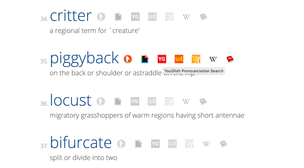
For another feature of the extension, a collection of links to external services in a list of saved words, I was annoyed by the repeated icons to external services: they were bloating the page. The words should stay the main content of the page, and this was not the case.

The solution:

Now the icon row is collapsible and collapsed by default to avoid visual bloat. I had some fun (and trouble) implementing CSS animations in inline-blocks 🙃. Here's a little demo of this functionality (or disguised advertisement for Google Define, youglish, and the Urban Dictionary).
Some trade-offs & decisions I made while designing this change:
A horizontal collapse with a triangle icon ▸ is not common. They are mostly used to hide and show a vertical content container, like a review with spoilers. In this case, the three-dot "More" burger menu would have been the more standard design pattern. I still chose the horizontal collapse, just because it was fun to implement and to experiment with it.
The "link" 🔗 icon to the left is slightly messy. Omitting it looks better, but it does add necessary meaning to the open/hide triangle button.
To open the link configuration, the standard settings ⚙️ icon was used because it was available in the existing font symbol set of the site. Otherwise, an editing pen symbol would have been more fitting.
I still want to see how I can visually tune the menu so it looks more organized. If a proper UI designer is reading this, feel free to send help! Feedback is also welcome, always.